Pub-quality pours from the comfort of home
- User research
- User interface
- Agile/scrum
- Wireframing
- Stakeholder management
- Customer journey mapping
Why this is important for Beerwulf?
Beerwulf is a beer e-commerce platform operating in 10 markets across the UK and EU. Delivering to remote UK areas is expensive. 12% of our UK customers are ordering from remote areas and they are paying standard shipping rates.
The business believes that by charging customers living in remote areas of the UK, we can save some thousands of euros per year.
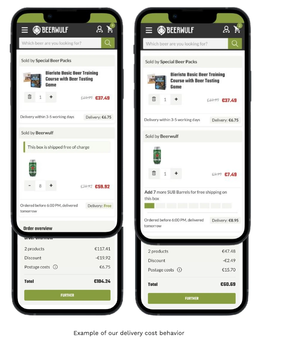
Into the delivery situation
A big issue we're dealing is that our delivery system is complicated and confusing for customers.
At Beerwulf, we sell not only our own products but also offer items from other stores through our marketplace.
When someone orders from us and the marketplace at the same time, they end up with two different shipping fees because marketplace items are sent directly from those other warehouses.
In summary, there's a lot going on and we're going to add one more thing.
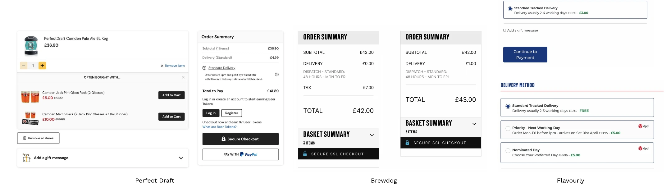
Competitive landscape
We're not the only ones in the market selling beer. When we looked at our competitors, we saw that most of them offer free shipping above a certain value, and we also observed competitors who charge a fee for delivery to remote areas. This gave us more confidence in implementing a similar strategy. However, we noted that the terms of these fees aren't always transparent, so we know that clarity is something we need to focus on.
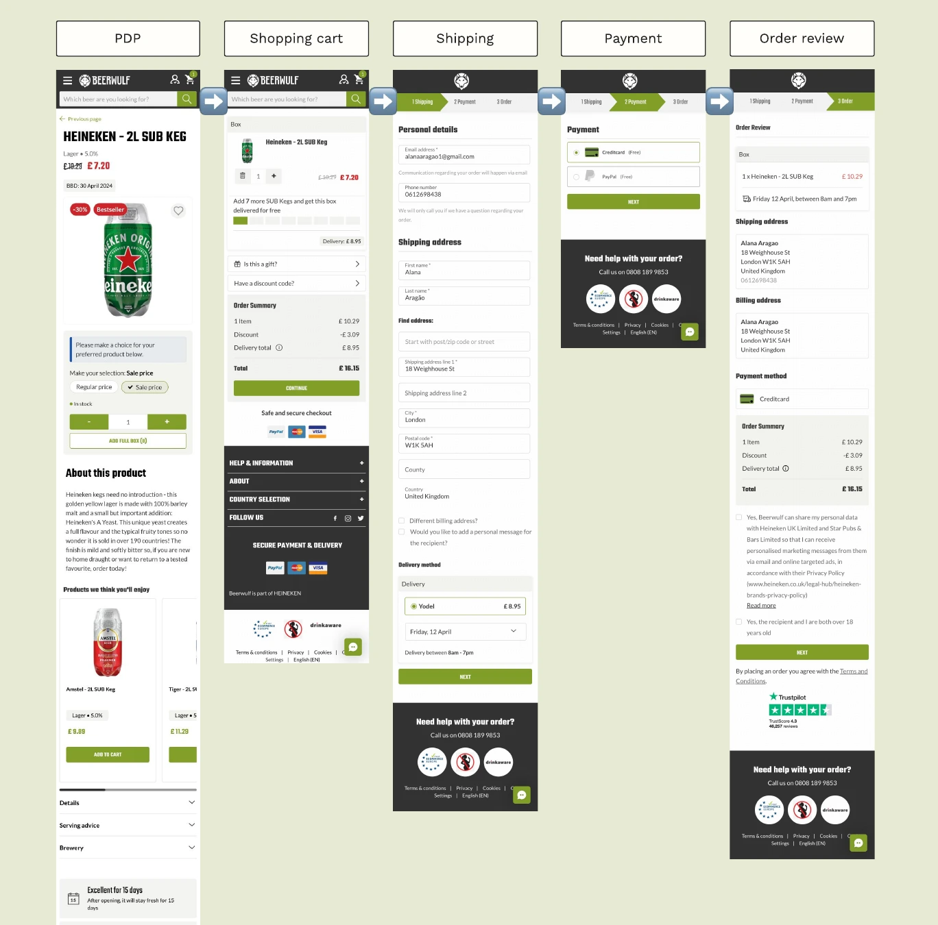
The user journey
To make this change, I examined how customers navigate our site to understand how we communicate delivery costs.
I wanted to find the best way to add new details clearly and easily, without making things confusing.
We communicate the shipping fee:
- In the product box
- In the order summary box
Constraints
Due to business constraints, my scope of work was limited to bringing as much clarity as possible to the buyer. So it was really about communication.
The solution needed to be scalable to include other shipping options like next-day delivery.
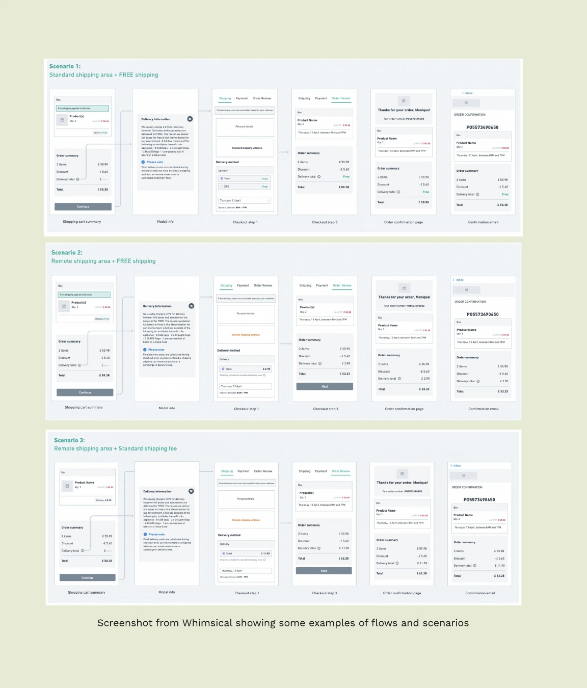
- If the order is normally free, for this user from a remote area there will be a fee.
- If it is not free, they will pay a bit more than the standard shipping.
Communicating in the best way
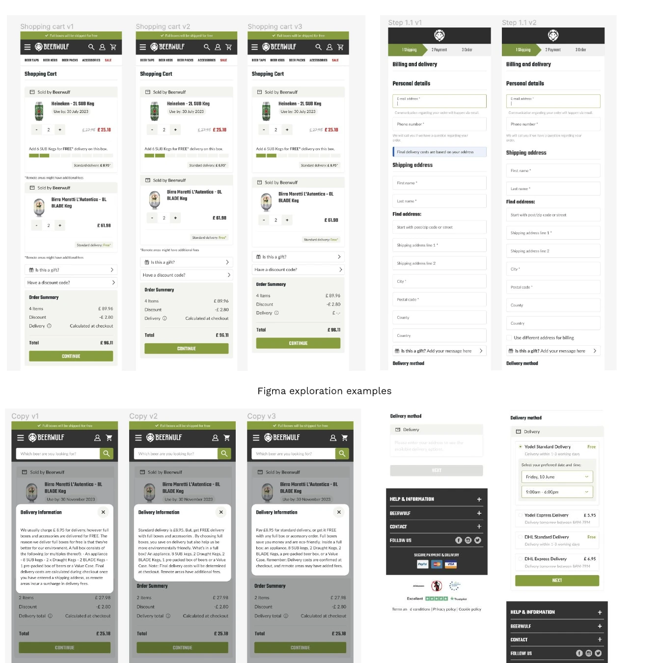
We came up with some design principles to guide us and make sure that we'll succeed in our mission.
- Clarity and transparency: We explain every part of the shipping fee, especially for remote places, in a simple way.
- Consistency: We make sure shipping fees are shown the same way everywhere on our site, including on product pages (if possible), in the cart, and during checkout.
- Positive effect: We show the shipping fee early in the shopping journey to prevent any surprises with hidden costs, ideally before checkout.
Tests and copy alignment
The solution explorations went through a combination of design + copy.
My main concern was not to compromise the message of free shipping that most of our users would see as 88% of them don't live in a remote area.
The final design
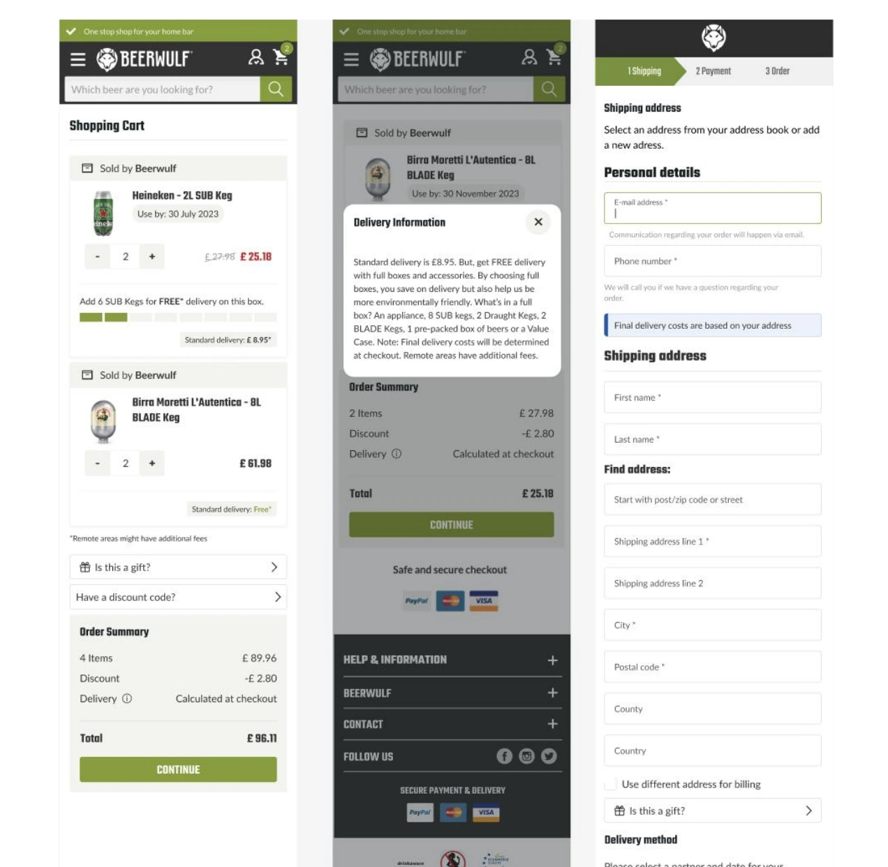
We had a few design reviews and ended up choosing this version to test because we believed was the best way to present the information in a non intrusive way.
To get here, we conducted usability tests to see if people were understanding the message we wanted to communicate.
Main changes
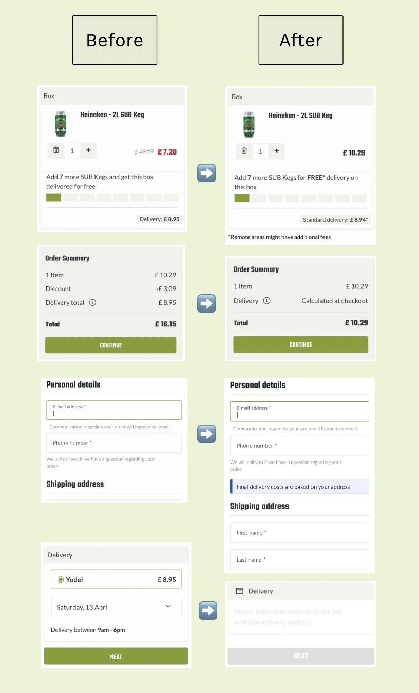
- We added a message below the card to highlight that while the shipping fee is displayed, those in remote areas will face an extra charge.
- Instead of 'delivery total' in the order summary, we changed the label to 'delivery,' omitted the price, and added 'Calculated at checkout'.
- We included a toast message to reinforce that when the user enters their address, they will know the shipping cost.
- We changed the behaviour of the delivery component when the person has not yet entered the zip code.
Measurement plan and future iterations
The solution is set to launch next quarter. We plan to monitor its performance monthly. With the Product Manager, we've created metrics to measure how well the new shipping fee works and to determine if we need to make further changes.
Key metrics:
- Conversion
- Cart Abandonment Rate
- Rage Clicks (especially on the information icon)
- Time on Page
- Click-Through Rate (CTR)
What’s next?
Preparing for the rollout...